Samsung’s annual developer event, they officially announced the One UI 7, calling it their biggest UI update to date. We even got a hands-on demo that gave us a close-up look at the new features on the S24 Ultra.
Samsung has confirmed when we can expect to get our hands on it. So, let’s dive into the 10 big changes coming with OneUI 7, which is based on Android 15.
One UI 7 Big Changes
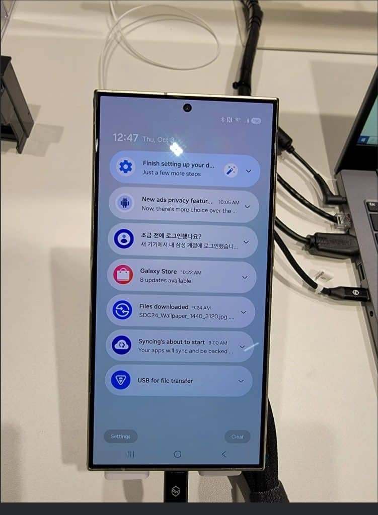
Split Notification Menu
Notification menu. Now, like iOS, Samsung has separated Notifications from Quick Settings. Swipe down from one side for Quick Settings and from the other for notifications. Google will also adopt this with Android 16 next year. If you’re not a fan, no worries. You can still revert to the old layout where they’re on the same page.
Design refinements
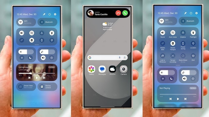
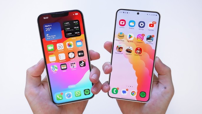
Refined Design Tweaks Next up, there are some design refinements. Notifications have a rounder look now, and the little arrow for expanding them has moved to the center. Quick Settings got some tweaks too, with a smaller brightness slider and a new volume slider next to it. The overall design has a Material You vibe. It aligns closely with Google’s Pixel UI. It is even slightly reminiscent of iOS
18’s Control Center. Oh, and don’t miss the pill-shaped battery icon in the status bar!
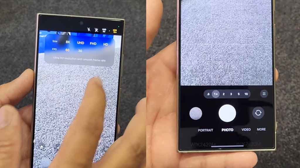
Camera app
The Camera app has several improvements. Samsung has revamped the Camera app. Most of the controls are moved to the bottom of the screen for easier one-handed use. Whether you’re switching modes or tweaking settings, no more awkward thumb stretches across the screen which will be super convenient.
App search bar
Smart App Search Bar Placement. Speaking of convenience, the app search bar has also been relocated to the bottom. This is similar to what Apple did in iOS. It’s a simple change but a really practical one—no more finger gymnastics when you’re trying to search for apps.
Multitasking menu
multitasking menu, switching to a stacked style, which is something you could already do using Good Lock. Now, it’s the default, and I have to say, it’s a welcome change. It makes multitasking look cleaner and feel more intuitive.
Icon redesign
Changes is in the icon redesigns. Samsung hasn’t touched their icons in years, but now they’re more vibrant and colorful. The Gallery app got a new rainbow gradient behind the flower image. The Camera icon now looks more like an actual camera. Icons for the Galaxy Store, Contacts, Settings, and Phone have been redesigned. These changes give the UI a more modern and lively feel.

Improved animations
Smoother Animations Now, let’s talk animations. This is still an early beta. So the improvements aren’t super obvious yet. However, Samsung said they’ve made significant upgrades to the animations. These upgrades are making them much smoother. People testing the software are saying it’s on par with iOS, which would be huge. If they can deliver on this, it’ll make OneUI 7 feel a lot more responsive and polished.
Dynamic Island
Working on its version of Dynamic Island, a status bar chip that expands and contracts with animations. It’s not on the demo units yet, but sources like Ice Universe say it’s coming.
Gallery AI
AI-Powered Gallery Samsung is also integrating AI into the Gallery app. Think of it like Google Photos. You’ll be able to search for photos or specific parts of videos just by describing what you’re looking for. Plus, the AI will automatically organize everything, making it super easy to find that random picture you snapped months ago.
Continuity
Samsung ecosystem with a feature called continuity. You’ll be able to seamlessly transfer calls between your phone, tablet, or TV with just a simple gesture. This is a big step forward and could really tighten up the Samsung experience across their devices.
Release Timeline So, when’s this all coming? Samsung confirmed the Galaxy S25 will be the first phone to launch with OneUI 7. The release is scheduled for January. If you’re eager to try it out early, the beta program will open up in December. Final Thoughts All in all, OneUI 7 looks like a major upgrade. Samsung is focusing on making the interface simpler and more convenient while giving it a modern visual overhaul. I’m especially excited about the improved animations
Vishal Raj a Blogger and a Author! Fountainhead of iGadgetsBlog
